Tag Archive for: Benjamin Moore

Hello Shadow! The 2017 Color of The Year from Benjamin Moore

Color of the Year 2017 Benjamin Moore paints
Flashback October 2015: Benjamin Moore names Simply White as the Color of the Year and we experienced a visual cleansing of the palette.   We were swept away with the elegant simplicity of white. But this year, to remind us that there is no one-size-fits-all solution; Shadow, a deep amethyst, is named the 2017 Color of the Year. It is a sultry hue that will drive our sensibilities in a new direction for 2017.
Don’t worry if you’re not the dark brooding type, there is a full palette of complimentary colors introduced by Benjamin Moore to work beautifully with Shadow. And those of us who are clinging to the light airy ambiance of white will be pleased to note that it has not disappeared from our color radar.
Benjamin Moore 2017 color trends
While Benjamin Moore uses a dramatic entrance photo to entice us with Shadow’s moody nature, don’t let it frighten you. This sophisticated color can be introduced in small ways for an on-trend update. In fact the complex color composition of Shadow allows it to act as a neutral to be paired with colors you may already have at home.
The complete 2017 color direction includes delicate hues that can be accented by the gem stone qualities found at the deeper end of the palette. If you love drama, go ahead and wrap a room in you favorite passionate shade. For those of us who can’t commit, refresh your colors with accent and accessory pieces.
We’re not telling you to be a slave to fashion, in fact we love the classics. Think of this as a heads-up for colors that will be popping up in stores in 2017. Use what you love and give the others a knowing nod of recognition. Remember, every color and idea we know as a classic, began as a trend.

Color Trends 2017 Benjamin Moore Shadow

Shopping Links below


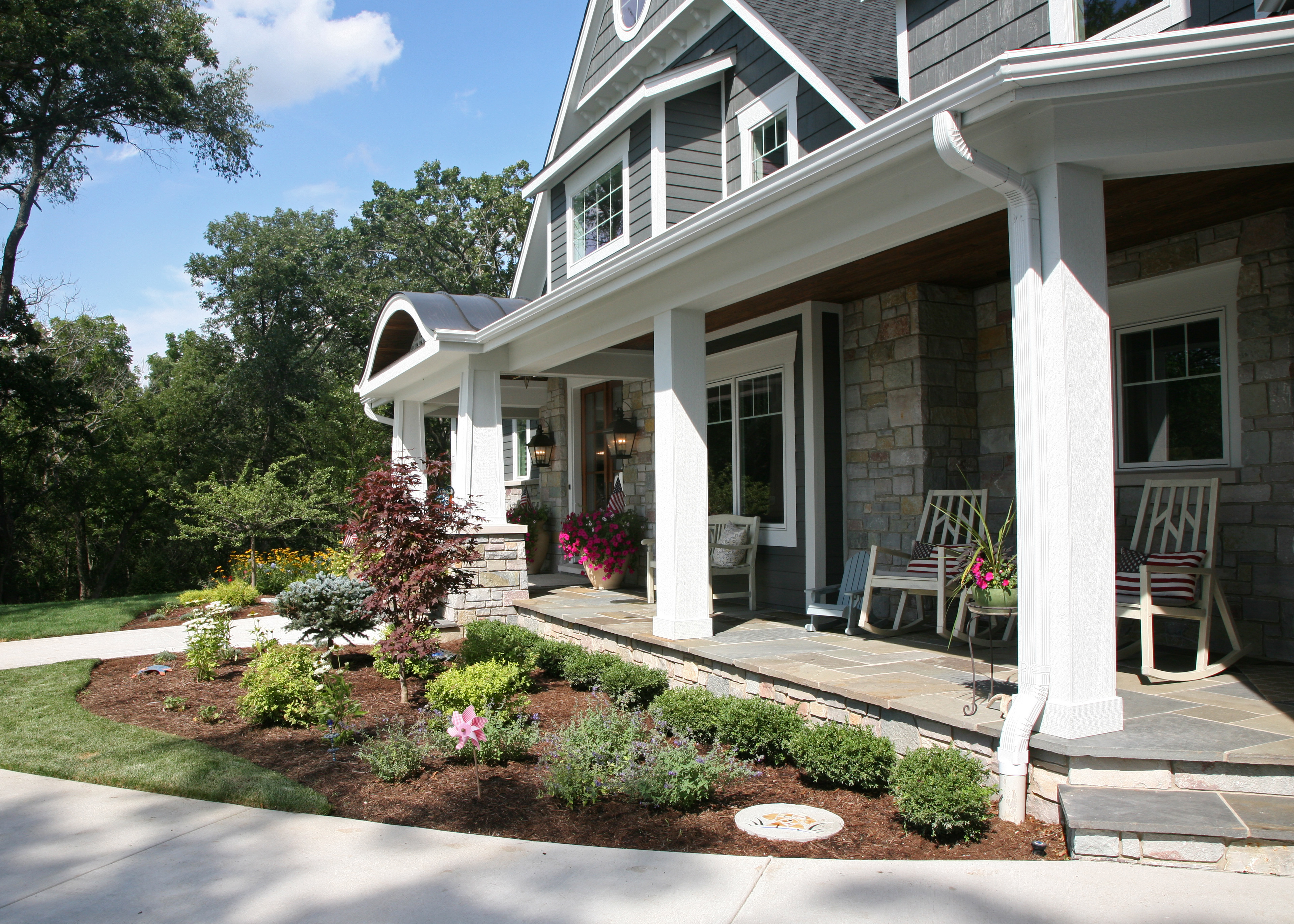
Adjust your eye to Benjamin Moore’s  Shadow by introducing artwork, area rugs or an accessory piece for an instant update. The entry door is an ideal place to go deep for major impact.
2017 Color Trends Benjamin Moore color of the year
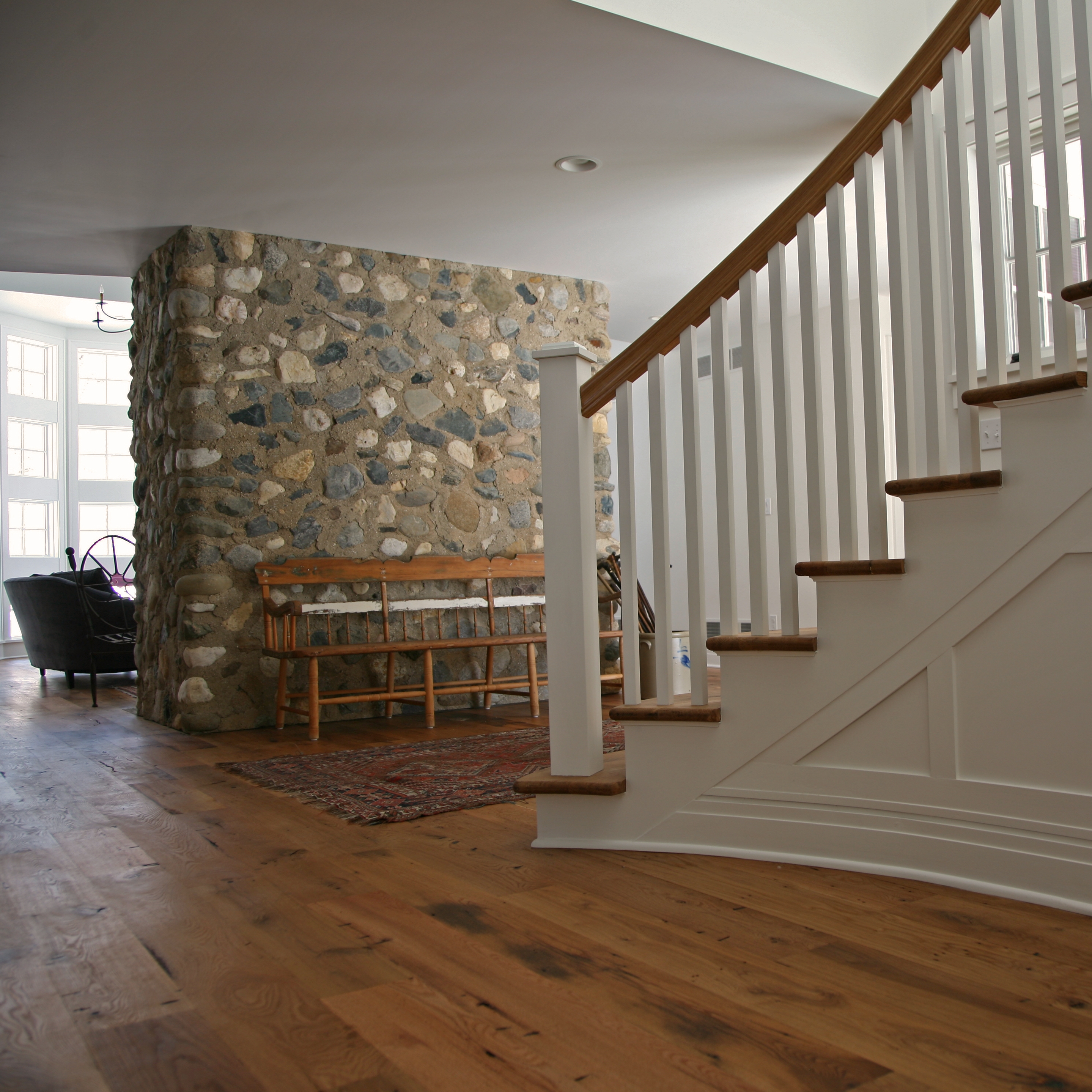
If you are completely infatuated with the 2017 palette, make a stronger commitment with granite, tile or cabinetry. This selection of cabinet finishes from Wood-Mode is available from Geneva Cabinet Company. They are true classics that take on a trendy attitude when paired with Shadow and the other deep companion hues.
Benjamin Moore Color Trends 2017 Shadow Color of the Year
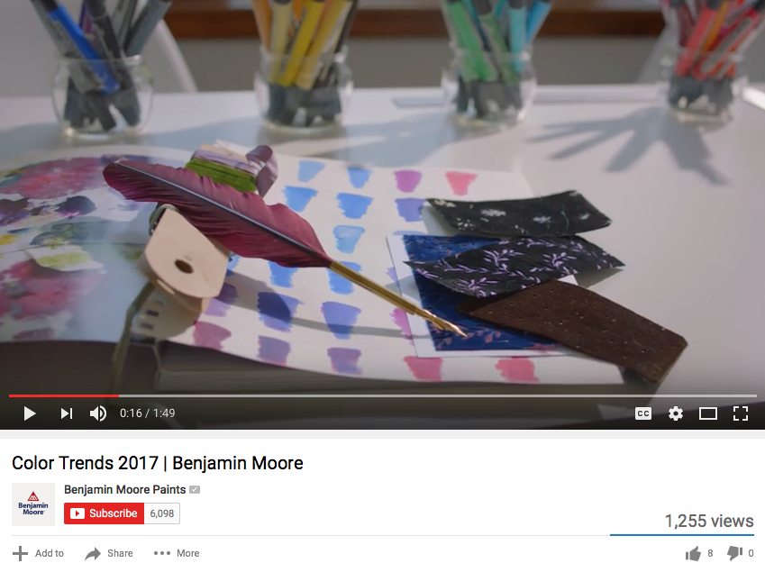
Benjamin Moore shares this video to explain some of the research behind this year’s choice for Color of the Year.
When you build or remodel with Lowell a team of experts will guide you through every detailed decision. Whether your style is timeless or trendy, our AIA architect and interior designer will support you with the latest updates and information for everything from architecture to color.

Lowell Custom HomesShopping Links:

Benjamin Moore Paints Color of the Year 2017
Geneva Cabinet Company
Trowbridge GalleryCharlotte Morgan Watercolour Tulips
Surya Rugs
Macy’s Bradbury Sofa
Ultimate Globe
LeCreuset Braiser in Amethyst
KitchenAid Mixer
Wood-Mode Cabinetry
Notting Hll Hardware
Merlin Glass
 

2016 Color of the Year for Your Home

How excited are you about the 2016 Color of the Year?
Even if you have not been breathless with anticipation, there is a value to watching as the 2016 Colors of the Year develop into trends that help you  freshen up the look of your home.
There is not much controversy between the two leading paint companies, Benjamin Moore and Sherwin Williams. Both select a version of white consistent with the current cultural desire for calm and simplicity.
bm and sw color of the year 2016
Benjamin Moore Simply White Video      Sherwin Williams Alabaster Video
From the standpoint of architectural integrity and composition, we agree with the importance of the color white in all of its variations.
However, when Pantone pioneered two interacting Colors of the Year 2016, Rose Quartz & Serenity, a new understanding of color direction emerged.

Screen Shot 2016-01-05 at 9.32.39 AM

Pantone Colors of the Year 2016 Video


Interplay or the interaction of color becomes the theme running through the 2016 color predictions.
Interplay is a technique we often use when creating interior and exterior architectural statements.  Here are some of our favorite ideas that will help you update the color impression of your home.
1 subtle layering nuance depth add fitterer millwork

Layer subtle shades of white to create dimension and refined nuance.


defining texture contrast white

Define architecture with white as a brilliant contrast to exterior color and material schemes.


Create restful space by applying the meditative quality of white or a pastel.


contrast with white trim on molding

Energize by contrasting a bold wall color with crisp white trim.


culbertson round staircase copy

Emphasize texture and enhance natural rustic materials with the calming contrast of white.


The Pantone 2016 Colors of the Year were selected with the intention of pairing calm harmonious hues. The specific color is not as significant as the fluidity of the pairing.    Keep balance in mind when applying color to your home and you will be on track for 2016.
Screen Shot 2016-01-05 at 9.27.18 AM

MARSALA Pantone’s Color of the Year 2015!

 
Who is Pantone and why should you care?
Well, they are actually the international color authority on trends and color messages. Their research has been guiding the colors we see in fashion, architecture and home décor for over 40 years. Now that this earthy hue has been identified as the emerging “it” color, companies can refer to the Pantone system to be sure they are speaking a consistent color language. This helps in the development of new products so colors will be complimentary across industries.
 
At Lowell we often use this full bodied hue to ground neutral color schemes without overwhelming them. It also has the ability to add warmth to cooler schemes that feature blues and greens.
3 Blog Image
Watch for Marsala to act as a unifying element in 2015. It is a sophisticated and confident shade able to mix well with the existing colors you love. The nurturing aspect of this color makes it an ideal addition for kitchen and dining areas. We will see it featured prominently in new fabrics and tabletop items especially when floral patterns are featured. As new products are introduced the draw of Marsala is sure to intensify.