Home Design Lesson – Color Flow

Color is one of our favorite techniques for creating beautiful flow to a home.  The skillful application of color will unify interiors for a cohesive design statement.  Here are a few ideas to help you establish a color palette, all accompanied by examples from talented designers used by Lowell homeowners.

Introduce Your Color Palette at the Entry

Interior Design and Photography by The Design Coach Phillip Sassano

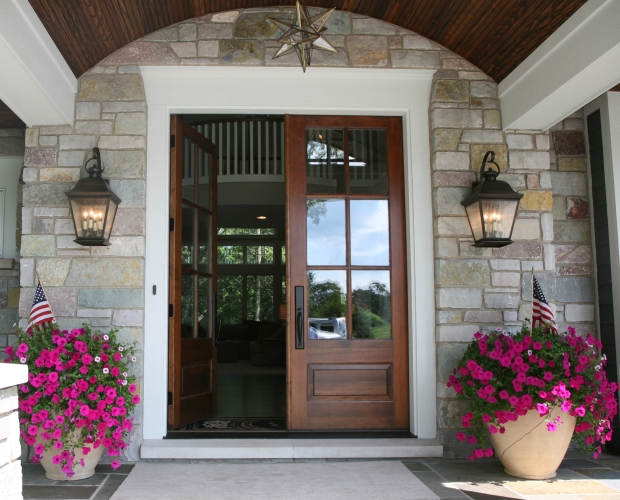
We love the idea of introducing a home color palette at the entry.  This can be one favorite color to set the tone, or a colorful area rug introducing a variety of colors soon to make an appearance.  Interior Design by The Design Coach

Use a Thread Color

Interior Design by Elizabeth Drake, Photography by Victoria McHugh

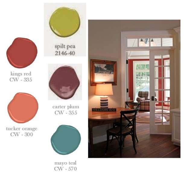
Using a thread color will unify your design.  Taken from Greek mythology, the red thread was used by Theseus as a connection that guided him to safety through a labyrinth of rooms.  Today, interior designers often use the concept to unite space by weaving a common color room-to-room.  This creates a stunning visual transition.   Using the thread color, in diverse proportions, will add variety and interest.  Interior Design by Elizabeth Drake

Consider Sightlines

Interior Design by Homeowner, Photography by Shanna Wolf

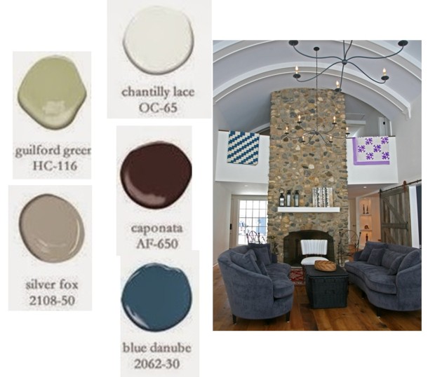
Be aware of the view as you gaze across your space.  Aim for continuity in every direction within your line of sight.  This can be achieved with a consistent wall color or furnishings and accessories that express your color palette.

Color Inspired by the View

Interior Design by North Shore Nest, Photography by Aimée Mazzenga

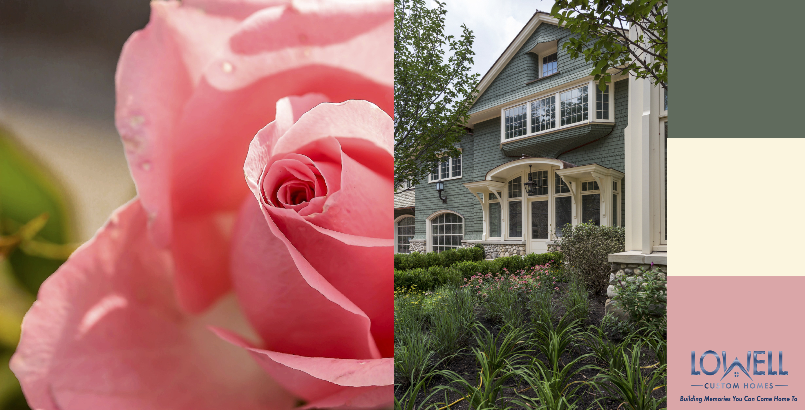
When the view is amazing, it’s natural to want to bring outdoor colors in.  A  scheme can evolve organically by duplicating colors found in nature. Selecting the watery blues from Geneva Lake or relaxing greens from woodland property is lovely inspiration for a home palette. Interior Design by North Shore Nest

Color to Reflect a Mood

Interior Design by North Shore Nest, Photography by Aimée Mazzenga

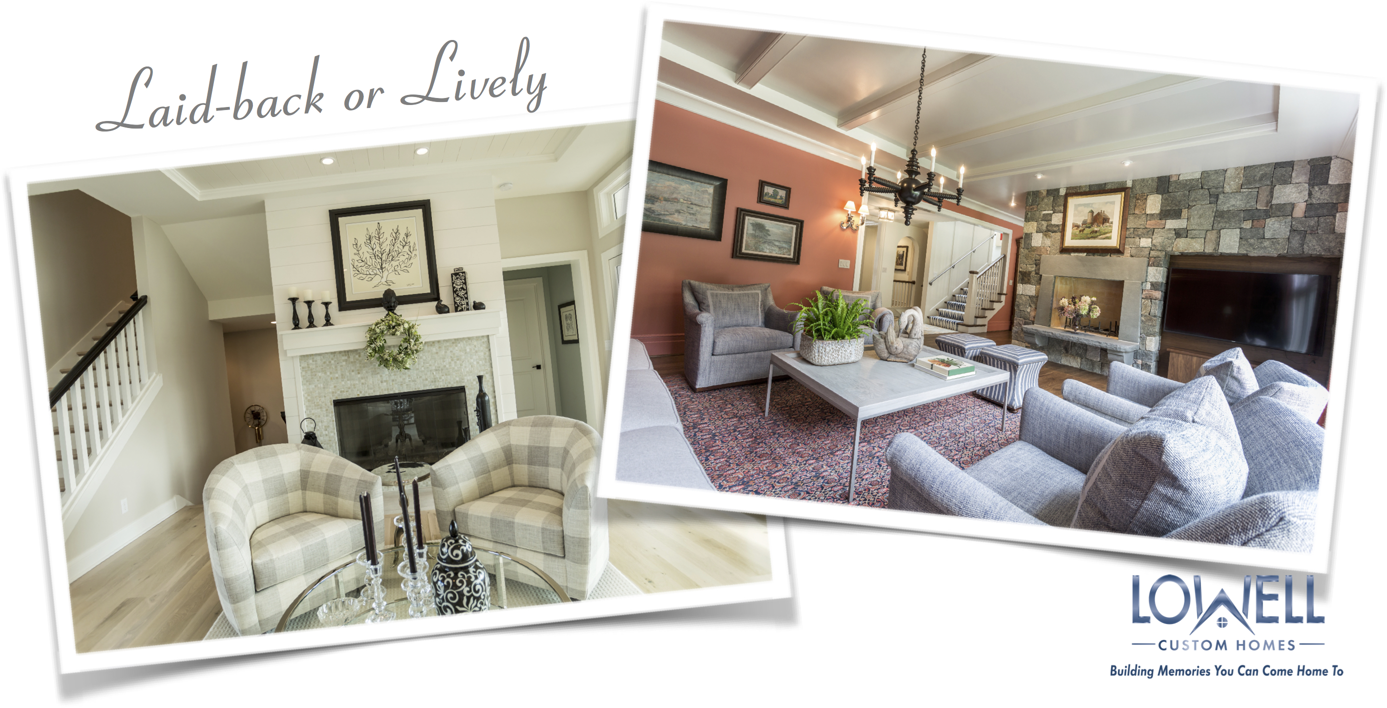
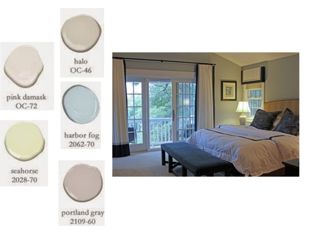
Color can express a mood. Blues and greens naturally cool and relax.  Reds and oranges and warmth and vitality.  When applied to a suite of rooms, the color scheme will unify and define the space.  Interior Design by North Shore Nest

Color to Energize

Interior Design by Michelle Hackworthy of Zander’s Interiors, Photography by Shanna Wolf

When you live for color, we encourage you to use it with abandon!  Try out bold colors with small pops in artwork or accessories on a neutral background.  When ready for a grand color statement, splash it on the walls or commit with larger furniture or fixtures.  Interior Design by Michelle Hackworthy of Zander’s Interiors

Add Wood Tones to the Mix

Interior Design by Lowell Custom Homes, Photography by Shanna Wolf

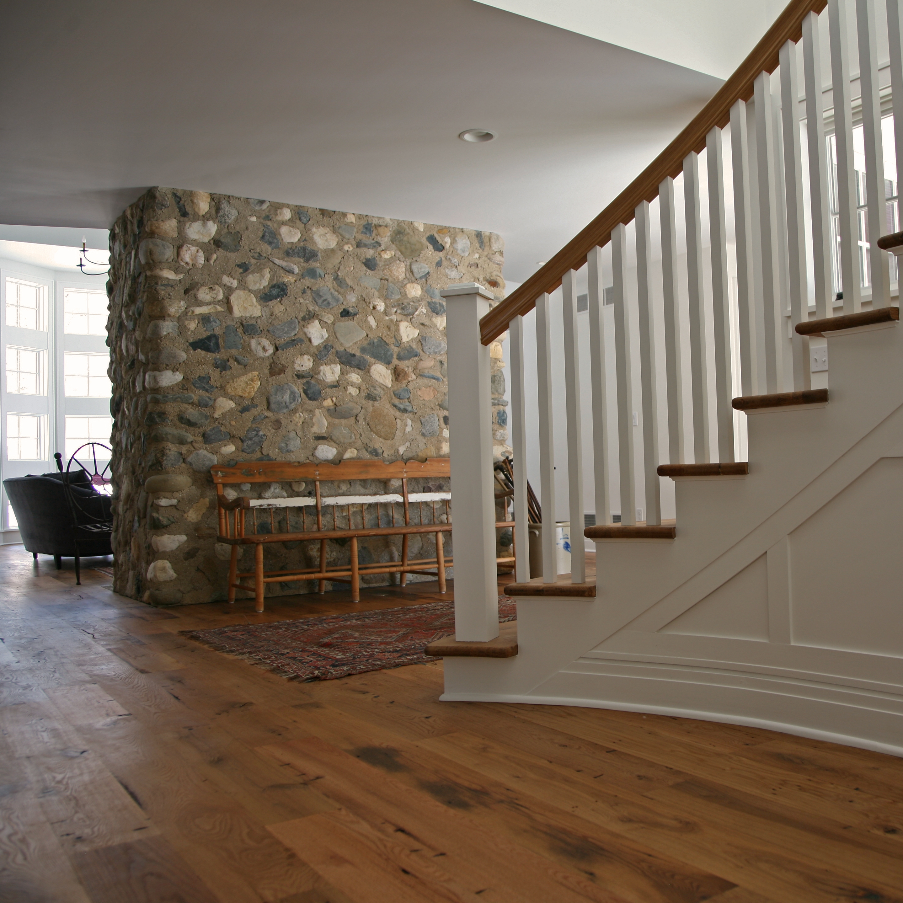
Don’t forget that woods have undertones of color. While matching wood from room to room is not the goal, keep in mind that common undertones can help you establish a warm and inviting flow.


Just remember, there is no longer one color-trend that everyone must follow.  Your home palette should work with your very personal color preferences.

For more tips on choosing your home paint colors visit our past blog by clicking here.

Connect with Lowell Custom Homes here

or call 262-245-9030


Photography by Aimée Mazzenga

Photography by Shanna Wolf

Photography by Victoria McHugh

Top 5 Tips for Picking the Perfect Paint Color for Your Home

Back away from the paint chips until you consider our Top 5 Tips for picking the perfect paint color. The first impression of your home is greatly influenced by color. In fact, humans have an actual physiological response to color which is known to influence emotions. Get it right with our easy guidelines and capture the ultimate feel-good at home!

Lowell Custom Homes How to Pick a Paint Color Mood

Tip #1 Choose Your Mood

  • Think about the mood and feeling you want for each space. The color scheme of your home can lead you through the day with bright colors for high energy areas or subtle colors in relaxed spaces.  This brief overview on Color Psychology & Your Moods will help you decide with colorful room images.


2 Inspiration PIX

Tip #2 Inspiration

  • Every great artist works from inspiration. Begin with something you love and expand on the idea to create a color palette.  Develop a harmonious flow from the exterior to the interior and throughout your entire home with an appealing common thread.  You can even use a home from the Lowell Custom Homes Gallery as inspiration.


3 Color and lighting PIX

Tip #3 Lighting

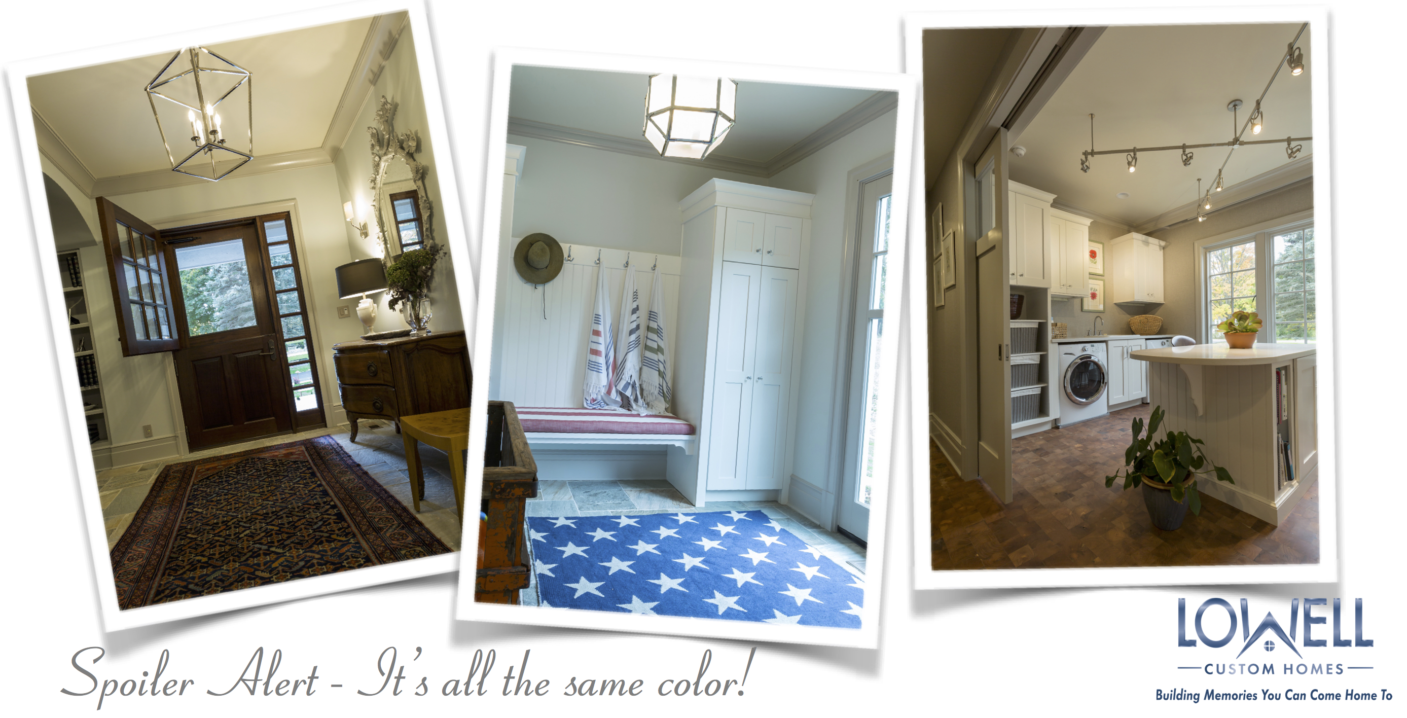
  • Hold on to your paintbrush, these three spaces are all painted with the same color, Benjamin Moore #962 Gray Mist. The difference is lighting. For this reason it is critical that you choose your color in the actual room where it will be used, or at least in a space with identical light.   The following are key factors for how color is perceived.
    1. natural light
    2. artificial light
    3. room size and
    4. architecture
  • Our Interior Detail Gallery has wonderful examples to demonstrate the interplay of natural and artificial light in a variety of spaces.


4 Whites with lowell entry

Tip #4 White is a Color Too

  • There is no such thing as “just paint it white”. White is actually one of the most difficult colors to get right. Trim and ceiling colors must have compatible undertones to the wall color. While you’re thinking about undertone, be sure to also apply this concept to the  stained finishes in every rooms.

 
whitest white land of color PIX

  • If you are searching for the whitest white possible, take a look at the recommendations from Land of Color.


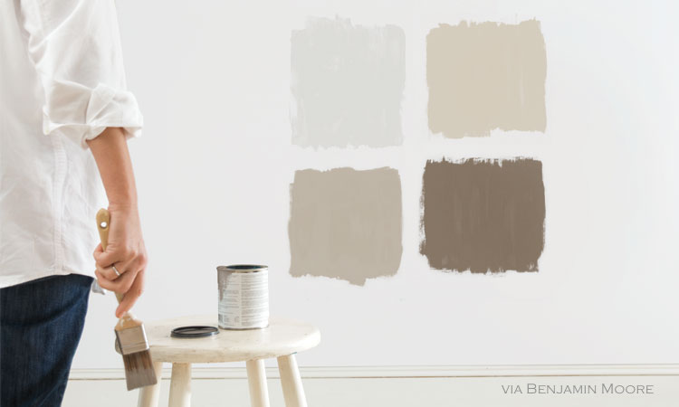
CR-BG-Paint-Neutral-Wall-Swatch Benjamin Moore

Tip #5 Always Test Your Color in the Exact Finish You Need

  • You know the drill, paint swatches on sections of your walls around the room. Check the swatches out at various times during the day and be sure you can live with any variation caused by changes in natural light. *Time Saving Tip – Often a designer or the paint store will be able to order larger paint sample sheets that you can tape directly to the walls.
  • Be sure to test the color sample in the finish you will be using. Matt, eggshell or gloss finishes all reflect light differently and will influence the final color impression.

 
Don’t be afraid of color,  but respect the pitfalls of a rushed decision. Start with these 5 Top Tips.   If you need extra confidence, definitely rely on the opinion of experts.

Lowell Custom Homes 

Hello Shadow! The 2017 Color of The Year from Benjamin Moore

Color of the Year 2017 Benjamin Moore paints
Flashback October 2015: Benjamin Moore names Simply White as the Color of the Year and we experienced a visual cleansing of the palette.   We were swept away with the elegant simplicity of white. But this year, to remind us that there is no one-size-fits-all solution; Shadow, a deep amethyst, is named the 2017 Color of the Year. It is a sultry hue that will drive our sensibilities in a new direction for 2017.
Don’t worry if you’re not the dark brooding type, there is a full palette of complimentary colors introduced by Benjamin Moore to work beautifully with Shadow. And those of us who are clinging to the light airy ambiance of white will be pleased to note that it has not disappeared from our color radar.
Benjamin Moore 2017 color trends
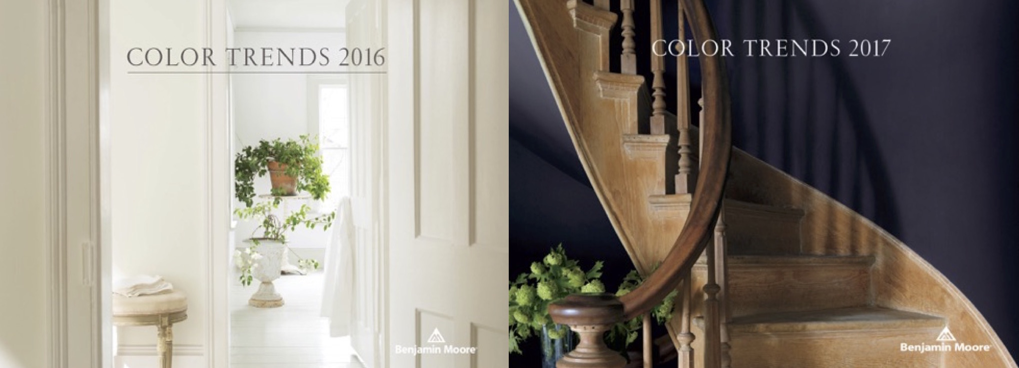
While Benjamin Moore uses a dramatic entrance photo to entice us with Shadow’s moody nature, don’t let it frighten you. This sophisticated color can be introduced in small ways for an on-trend update. In fact the complex color composition of Shadow allows it to act as a neutral to be paired with colors you may already have at home.
The complete 2017 color direction includes delicate hues that can be accented by the gem stone qualities found at the deeper end of the palette. If you love drama, go ahead and wrap a room in you favorite passionate shade. For those of us who can’t commit, refresh your colors with accent and accessory pieces.
We’re not telling you to be a slave to fashion, in fact we love the classics. Think of this as a heads-up for colors that will be popping up in stores in 2017. Use what you love and give the others a knowing nod of recognition. Remember, every color and idea we know as a classic, began as a trend.

Color Trends 2017 Benjamin Moore Shadow

Shopping Links below


Adjust your eye to Benjamin Moore’s  Shadow by introducing artwork, area rugs or an accessory piece for an instant update. The entry door is an ideal place to go deep for major impact.
2017 Color Trends Benjamin Moore color of the year
If you are completely infatuated with the 2017 palette, make a stronger commitment with granite, tile or cabinetry. This selection of cabinet finishes from Wood-Mode is available from Geneva Cabinet Company. They are true classics that take on a trendy attitude when paired with Shadow and the other deep companion hues.
Benjamin Moore Color Trends 2017 Shadow Color of the Year
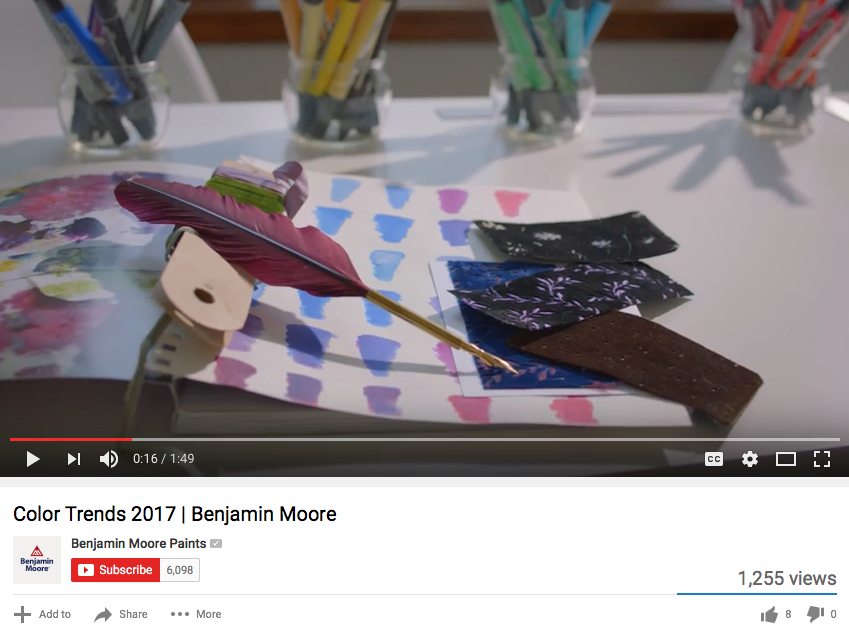
Benjamin Moore shares this video to explain some of the research behind this year’s choice for Color of the Year.
When you build or remodel with Lowell a team of experts will guide you through every detailed decision. Whether your style is timeless or trendy, our AIA architect and interior designer will support you with the latest updates and information for everything from architecture to color.

Lowell Custom HomesShopping Links:

Benjamin Moore Paints Color of the Year 2017
Geneva Cabinet Company
Trowbridge GalleryCharlotte Morgan Watercolour Tulips
Surya Rugs
Macy’s Bradbury Sofa
Ultimate Globe
LeCreuset Braiser in Amethyst
KitchenAid Mixer
Wood-Mode Cabinetry
Notting Hll Hardware
Merlin Glass
 

Refreshing Spring Updates for your Home

1 Lowell Management FINAL pix Spring

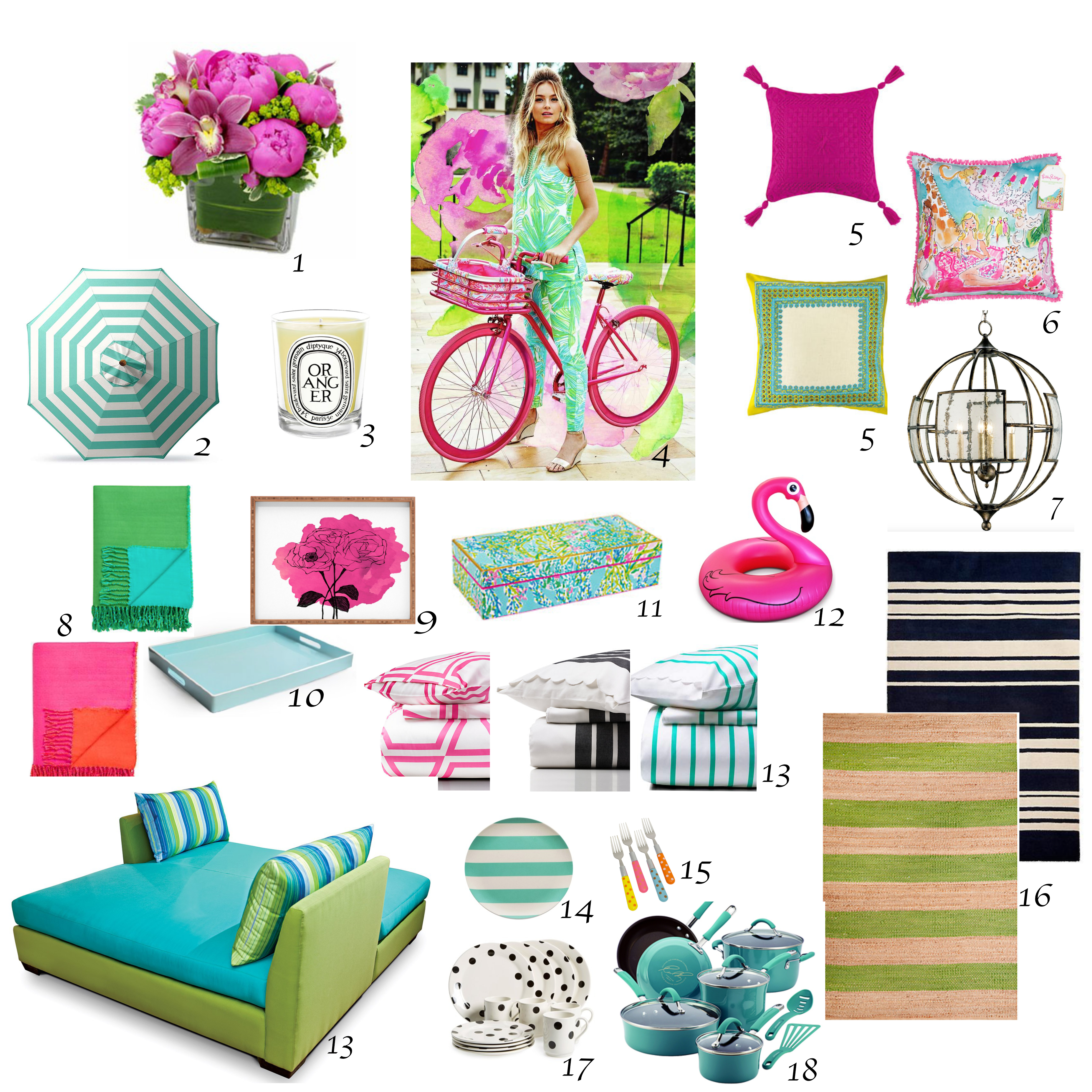
Spring is nature’s time for renewal and the ideal time to bring your home out of hibernation. Celebrate the season by adding a few refreshing touches from our list of favorite home pick-me-ups.

  • Awaken your senses with flowers and scented candles for an instant lift. Use them generously in the most visible and well traveled areas of your home
  • Reposition furniture to take advantage of natural light and outdoor views
  • Brighten the bath by accenting with colorful towels and accessories
  • Lift heavy area rugs to enjoy the natural flooring or replace them with indoor/outdoor sisal
  • Use color and bold pattern in your toss pillows, throws and accessories for a lively accent
  • Lighten the look of your mantel and bookcases by storing away heavy accessories to keep the space open for a visual breath of fresh air
  • Spice up the kitchen with cheerful pops of color in cookware, tableware and serving pieces
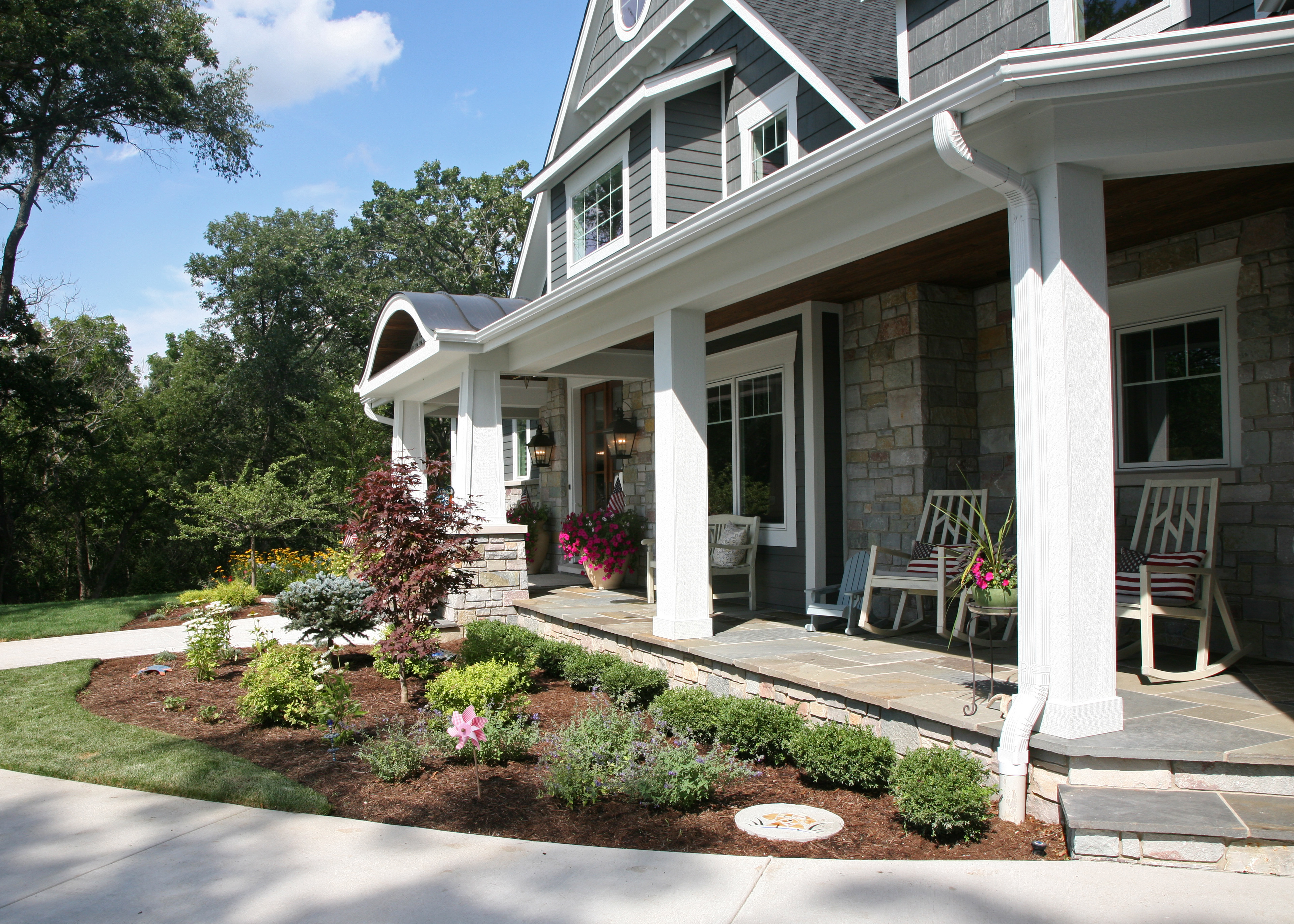
  • Relate your home’s indoor and outdoor color palettes for a seamless connection to the exterior
  • Upgrade your standard entry fixture with one that makes a memorable style statement
  • Add a ceiling fan to covered porch or patio areas to create your own gentle breeze
  • Gather attractive trays for portable outdoor service with easy clean up
  • Display summer themed collections and playful activity equipment to set the mood for fun
  • Select outdoor furnishings based on the way you want to use your space. A daybed, outdoor bar or fire pit benches may serve you better than the customary umbrella table with chairs

For inspiration, take a look at some of these perky finds! 

Happy Spring!

 Shopping Links Below


1 /2/3/4/5/6/7/8/10//11/12//13/14/15/16/17/18/19


2016 Color of the Year for Your Home

How excited are you about the 2016 Color of the Year?
Even if you have not been breathless with anticipation, there is a value to watching as the 2016 Colors of the Year develop into trends that help you  freshen up the look of your home.
There is not much controversy between the two leading paint companies, Benjamin Moore and Sherwin Williams. Both select a version of white consistent with the current cultural desire for calm and simplicity.
bm and sw color of the year 2016
Benjamin Moore Simply White Video      Sherwin Williams Alabaster Video
From the standpoint of architectural integrity and composition, we agree with the importance of the color white in all of its variations.
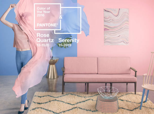
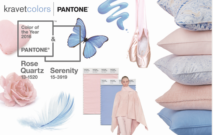
However, when Pantone pioneered two interacting Colors of the Year 2016, Rose Quartz & Serenity, a new understanding of color direction emerged.

Screen Shot 2016-01-05 at 9.32.39 AM

Pantone Colors of the Year 2016 Video


Interplay or the interaction of color becomes the theme running through the 2016 color predictions.
Interplay is a technique we often use when creating interior and exterior architectural statements.  Here are some of our favorite ideas that will help you update the color impression of your home.
1 subtle layering nuance depth add fitterer millwork

Layer subtle shades of white to create dimension and refined nuance.


defining texture contrast white

Define architecture with white as a brilliant contrast to exterior color and material schemes.


Create restful space by applying the meditative quality of white or a pastel.


contrast with white trim on molding

Energize by contrasting a bold wall color with crisp white trim.


culbertson round staircase copy

Emphasize texture and enhance natural rustic materials with the calming contrast of white.


The Pantone 2016 Colors of the Year were selected with the intention of pairing calm harmonious hues. The specific color is not as significant as the fluidity of the pairing.    Keep balance in mind when applying color to your home and you will be on track for 2016.
Screen Shot 2016-01-05 at 9.27.18 AM

Fashion Week Trends Inspire Home Decor for Spring

Just in time for spring, reports from Fashion Week are announcing the latest trends from the runway!  The desire to be surrounded at home by these same fresh style and color combinations is just natural. Fortunately the lag time that used to exist between fashion and home décor has almost vanished.  Here we translate the top designer looks to help you achieve immediate gratification when refreshing your home this spring with runway inspiration.
As you browse keep in mind the words of fashion leader Diane Von Furstenberg, “The most important thing, in both fashion and your home, is to know who you are and be true to that”
1 Nautical Trend
Nautical Chic
Utility and ease inspire this look that works so well for homes in Lake Geneva or any area to achieve the style simplicity of resort chic.   You can create the same nautical mood with non-traditional colors and stripes as reported on the runway by InStyle.  Introducing graphic stripes with creative color schemes is a stylish way to bring this trend to homes where the traditional blue/red/white theme doesn’t fit.  Detailing with accents that feature marine brass or shipyard riveting will further an authentic atmosphere.
2 White Hot Trend  White and Wood Project1
White and Wood
Nothing says warm weather like crisp bright white.  This season proper white was softened on the runway by Balenciaga with unexpected accents like gym shoes or deep leathers for a less serious mood.  We are taking the same approach in homes with the intentional contrast of interesting woods to highlight interior white finishes.  The kitchen above features Plato Woodwork cabinetry by Geneva Cabinet Company and uses natural walnut counters.  This introduces a bit of warmth and edginess to reduce the formality of otherwise traditional décor.
Opting for attention, bright yellow was featured on the runway by designers like Tory Burch. optimistic, yellow never fails to get noticed.  At small dose of bright lemon yellow in accessories achieves the effect, think daffodils.  Softer versions will create a gentle background for lively or traditional color schemes
Sunshine Yellow
Opting for attention, bright yellow was featured on the runway by designers like Tory Burch.  Cheerful and optimistic, yellow never fails to get noticed. At small dose of bright lemon yellow in accessories achieves the effect, think daffodils.  Softer versions will create a gentle background for lively or traditional color schemes.   Our country kitchen above uses mustard yellow as the perfect color statement.
4 Denim Project1Versatile Denim
Never far from the fashion front line, denim maintained its position as the go to fabric for casual comfort.  Creative washed finishes and tailored silhouettes ruled the runway in the Sonia Rykiel collection.  The application at home invites comfort and introduces a bit of street savvy style.  Upholstery and soft goods can reflect appealing washed finishes.  Even choosing a paint color in the range between pale chambray and dark wash will maintain the comfort connection.
5 FloralFloral & Gingham
Floral prints and gingham checks appeared in the Diane Von Furstenberg collection as well as many others. The key to this trend is the vibrant colors along with a stylized pattern approach. Bringing this idea home means introducing saturated color inspired by garden flowers. White is an important element in the success of this look, providing the proper context for the colors to breath.

Home Color Trends for 2015

While fun to speculate about the “it” color for 2015, conflicting predictions from major color experts can be puzzling. Marsala, Coral Reef, Blue Paisley? How do you know which color to choose for a fresh new look for your home that will not feel dated in a few years?
We take away the color confusion with this easy guide. It is based on our analysis of the 2015 Color of the Year predictions by experts like Pantone, Benjamin Moore, Sherwin Williams and Color Marketing Group. Using the color expertise we bring to every home we build, we created 4 key palettes for you to reference. Rather than focusing on just one fashion color, let these color collections help you create your scheme. Simply select colors from the collection that speaks to the mood you love!

Color Whisper These chalky sheer colors will restore balance and promote a peaceful and restful environment.

COLOR WHISPER
These chalky sheer colors will restore balance and promote a peaceful and restful environment.


Modern Classics Stabilize your interior by referencing historic color palettes then tweaking them for an updated feel.

MODERN CLASSICS
Stabilize your interior by referencing historic color palettes then tweaking them for an updated feel.


Nature Preserve The infusion of earth elements and the colors they represent is a way of grounding and connecting with nature.

NATURE PRESERVE
The infusion of earth elements and the colors they represent is a way of grounding and connecting with nature.


Celebrating Home A sure way to brighten your day is to introduce a kaleidoscope of optimistic hues inspired by global images and lively floral gardens.

CELEBRATING HOME
A sure way to brighten your day is to introduce a kaleidoscope of optimistic hues inspired by global images and lively floral gardens.

For more ideas and examples of how we use color check out our Portfolio pages http://lowellmanagement.com/living.html

*Digital color swatches used to demonstrate trends are Benjamin Moore proprietary colors via Pintrest. When choosing colors you must selected from actual paint samples available at your local paint store.*

MARSALA Pantone’s Color of the Year 2015!

 
Who is Pantone and why should you care?
Well, they are actually the international color authority on trends and color messages. Their research has been guiding the colors we see in fashion, architecture and home décor for over 40 years. Now that this earthy hue has been identified as the emerging “it” color, companies can refer to the Pantone system to be sure they are speaking a consistent color language. This helps in the development of new products so colors will be complimentary across industries.
 
At Lowell we often use this full bodied hue to ground neutral color schemes without overwhelming them. It also has the ability to add warmth to cooler schemes that feature blues and greens.
3 Blog Image
Watch for Marsala to act as a unifying element in 2015. It is a sophisticated and confident shade able to mix well with the existing colors you love. The nurturing aspect of this color makes it an ideal addition for kitchen and dining areas. We will see it featured prominently in new fabrics and tabletop items especially when floral patterns are featured. As new products are introduced the draw of Marsala is sure to intensify.